Some projects start with a brief. This one started with a sentence. Dr. Cooper Wahl, a veterinarian in Denver, told me the idea behind his new business:
“Oral care is super important but not accessible to a lot of pet owners due to the cost, so by taking out a lot of the overhead, I can provide gold standard care at a fraction of the cost.”
From a truck, family owned, dental care for cats and dogs only. My job was to give that idea a face, a home online and a way to book. Here’s how it came together, including what we got wrong first.
Narrowing it down to one thing
To move fast, I started from a generic website template and rebuilt it as clean, hand-written pages. A template gives you structure. It doesn’t give you focus.
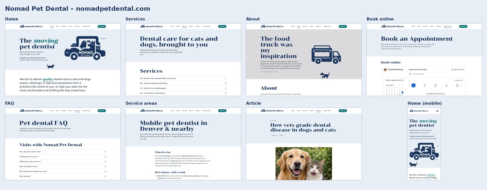
So the first design decision was subtraction. Every page had to be about dental care for cats and dogs, and anything that wasn’t got cut. The services page lists exactly what Cooper does: exams, cleanings, dental X-rays and extractions.
Cooper had a clear sense of how he wanted to be seen: family owned and owner operated. In his words: “A lot of customers are trying to find something that’s owner operated, locally... family operated.” That positioning shows up all over the site.
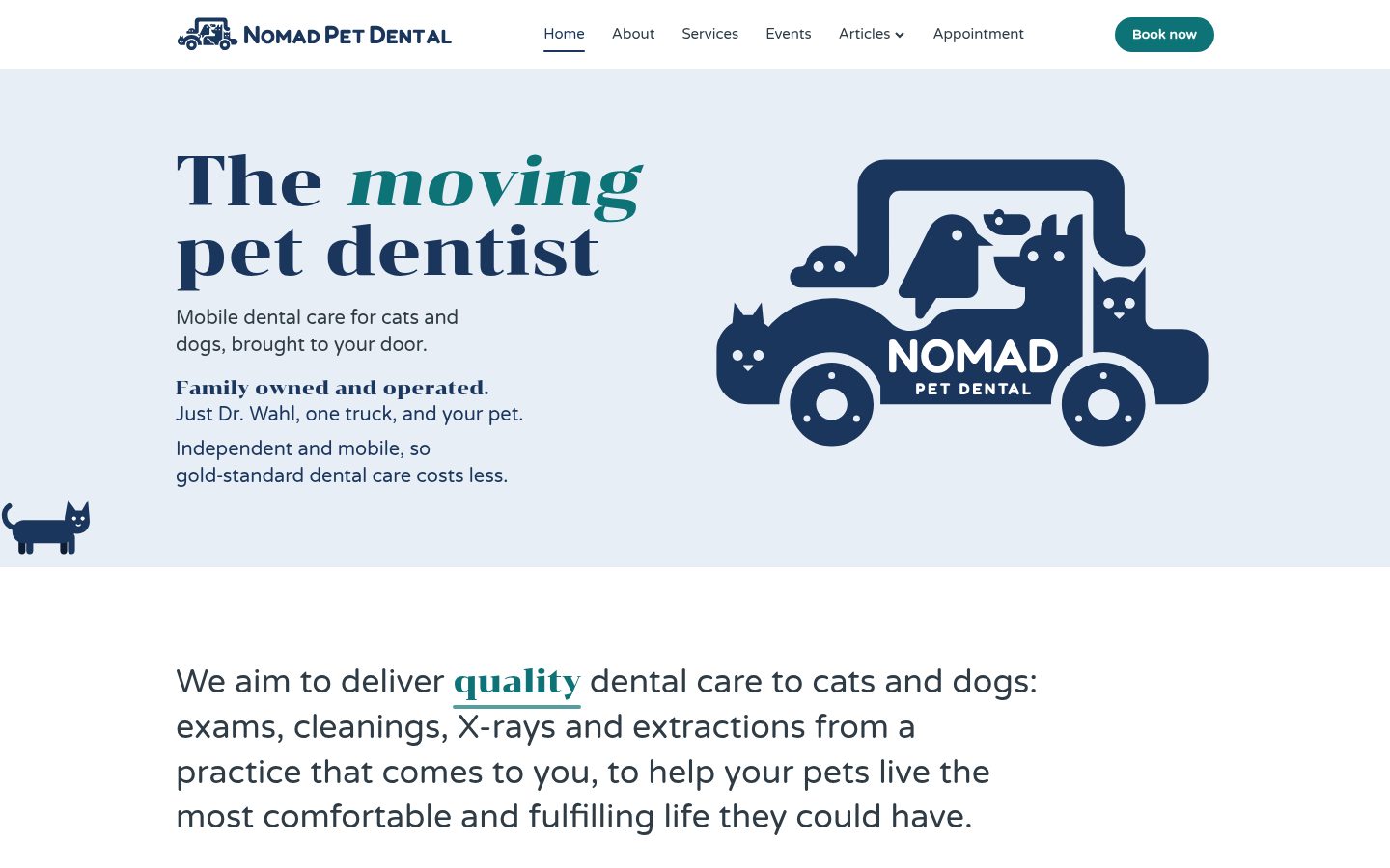
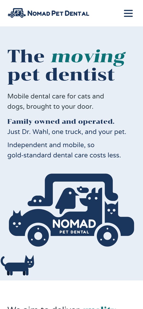
The headline came out of that same narrowing: “The moving pet dentist.” It’s short, a little playful, and it says both halves of the business at once.
The truck, four ways
The logo took the longest, which is normal. It has to feel right to the person whose name is on it.
- Version one was my first sketch: a van made of animals with a simple wordmark.
- Version two brought that van to life in the homepage hero as a gently bouncing animation.
- Version three was bolder: a big truck with a chunky “NØMÄD” wordmark. I liked it. Cooper called it “butch-y”. He liked the fonts, but the bold logo and the lettering didn’t go together, and it didn’t match the gentle, family feel of the business.
- The final “hybrid” keeps the big truck’s body and animals but swaps the lettering for NOMAD / PET DENTAL in Fredoka, a softer, rounded font. Cooper especially liked the serif headline font next to the new truck, so that pairing stayed. Solid white letters, wheels with little dots so you can see them turn, and a gentle bob that holds still for visitors who prefer less motion.
The lesson: show options early and listen for how people feel, not just which one they pick.
Color: orange to navy, then a little teal
The first palette was a bright orange. On a call, Cooper’s family pointed out something I hadn’t known: a couple of the big corporate vet chains use orange. For an independent practice whose whole point is not being a chain, that subconscious association was the last thing they wanted. So the palette moved to navy, with a “mountainy” Colorado feel of navy, greens and grays. Orange stayed only as a possible small accent.
Here’s where the way I build sites paid off. There’s no content management system and no theme settings, just plain text files. Swapping the color of the entire site took minutes, not a weekend. Navy on its own got a bit serious, so we added one accent color, teal. It’s used only where we want your eye to land: the “Book now” button and the rotating word in the headline.
The prettiest teals were too light to read, so we went darker until it passed accessibility contrast standards. It’s a small decision that quietly helps everyone.
Things we tried and pulled back
We added a solid navy “Family owned and operated” band to the homepage. It felt heavy, like a warning label. We thinned it, then swapped it for plain text under the headline: “Family owned and operated. Just Dr. Wahl, one truck, and your pet.” It’s quieter, and it says more.
Booking, payments and privacy
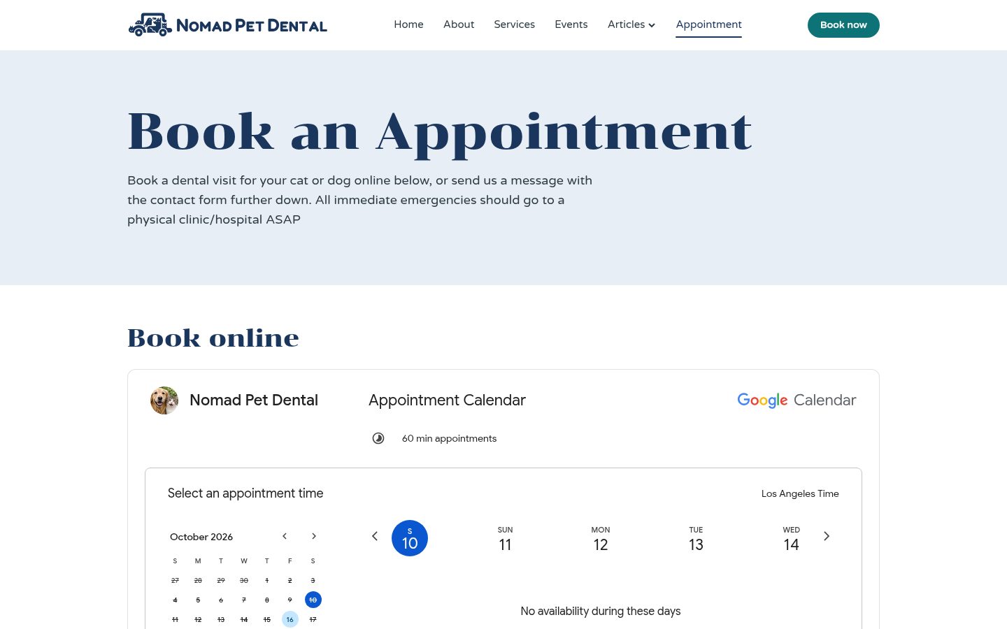
Booking was Cooper’s call. He wanted people to commit: a request form invites “maybe,” while picking a real time is a decision. We started with a link to his Google Calendar booking page, then embedded the calendar right on the appointment page so nobody has to leave the site. A simple contact form sits below for people who’d rather ask first.
Payments are Venmo. There’s a button on the appointment page and in the footer, plus a QR code that desktop visitors can scan with their phone.
Privacy mattered more than I expected. A mobile practice has no storefront, and the only street address available was Cooper’s home. We took it off the website and the printed materials, and wrote “Serving Denver and nearby areas” instead.
Helping people find it, and trust it
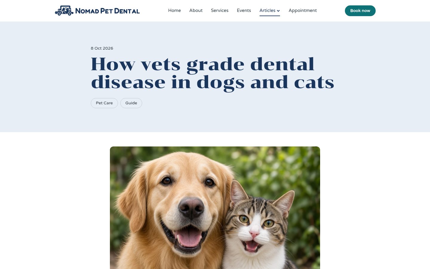
One of Cooper’s best insights was about education: “People don’t look at their animals’ teeth. But sometimes if you shock them by showing them, they’re like, ’oh yeah, those do need to get fixed.’” That’s what led to the dental grading article. Show people what healthy and unhealthy teeth look like, and the rest makes sense.
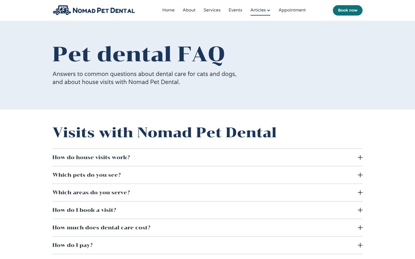
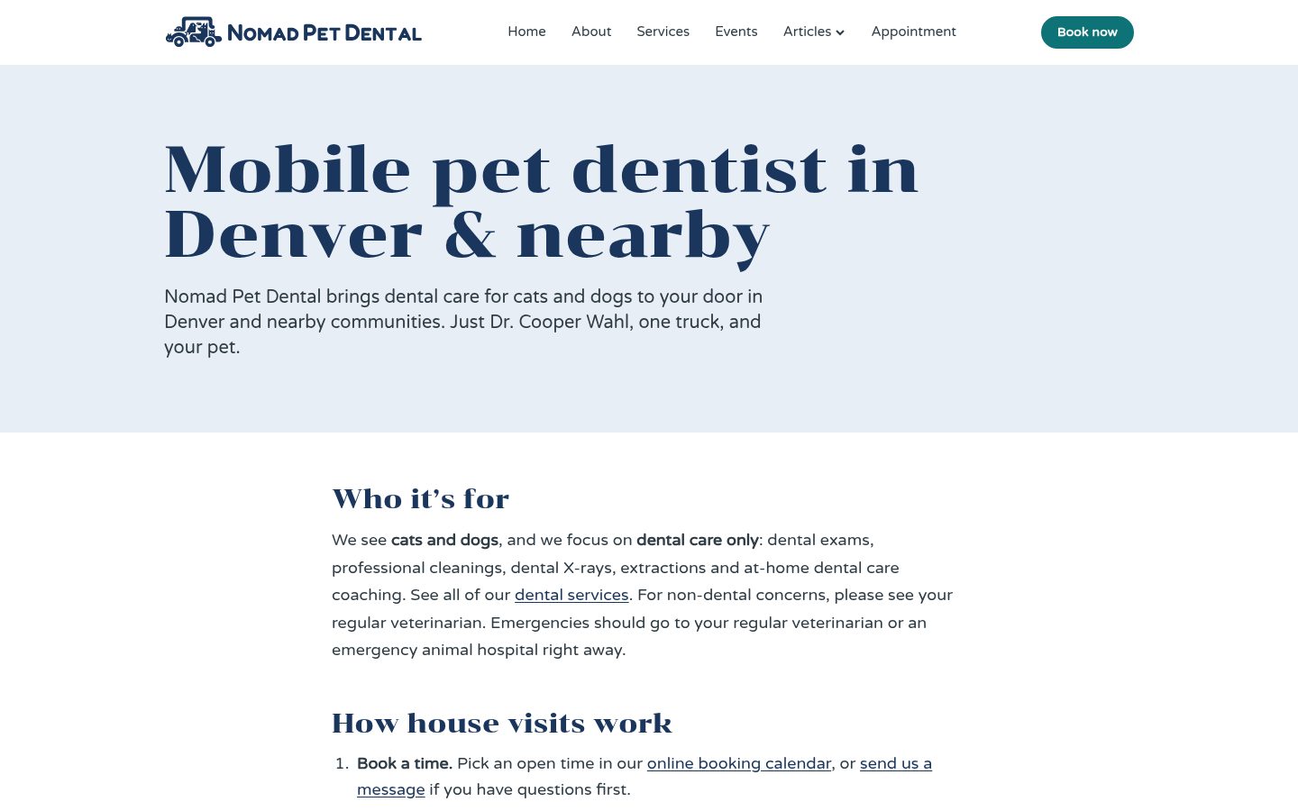
Alongside it came an FAQ (anesthesia, X-rays, extractions, brushing, payment), a service-areas page for “mobile pet dentist in Denver” searches, and local SEO behind the scenes: unique page titles, a sitemap and structured data for Google.
The brand also went to paper: business cards, letterhead and envelopes, with card files matched to Vistaprint’s exact specs so Cooper can reorder himself.
How we worked: preview first, plain-English requests
The big review happened on a 30-minute Zoom call. I shared my screen and walked Cooper and his family through the site page by page. I recorded it, so afterward I could pull out every change request instead of scribbling notes and missing half.
Every change, big or small, went to a preview copy of the site first. It went live only after the client said yes. Requests come in by email in plain words (“make the band thinner,” “I want to take Venmo”), with no system to learn. The live site is static pages on Cloudflare, so there’s nothing to patch and it’s fast on phones.
Cooper’s list isn’t done. He’s thinking about collecting reviews on Yelp and building grassroots referrals with local clinics, the word-of-mouth that matters most for a one-truck practice.
What I’d tell any small business or cultural organization
- Narrow first. Say one thing clearly.
- Check what your colors say. Make sure they don’t borrow someone else’s identity.
- Try, look, pull back. Previews make experiments cheap.
- Make the main action self-serve. Booking, tickets, donations or sign-ups.
- Protect your privacy. Your website doesn’t need your home address.
When Cooper saw it, he said: “It’s way cooler than I was expecting it to be. I was expecting, you know, like a one-page thing and it just had like a phone number and, you know, maybe a logo on it.”
If you’ve got an idea that needs a home online, or a website that isn’t pulling its weight, let’s talk. I’ll help you figure out what you actually need, and we’ll build it together, one approved preview at a time.